In our last building product marketing blog, we explained how granular search makes it easy for architects, engineers and contractors to find the specific materials they need for their commercial building projects.
While search capabilities are important, there are other elements of the user experience that digital marketers need to consider.
Responsive Design
If your website makes it hard for people to get what they need, they will leave. In general terms, people tend to gravitate towards clarity. A clean layout with concise messaging is a good place to start, but there’s more to consider than just the desktop.
You should keep in mind that your buyers are like everyone else – that means that increasingly, they are using their mobile devices as much or more than a traditional desktop. As such, you would be well advised to use what is known as a responsive design for your website.
“Responsive,” in this case, means responsive to the device being used to browse the website – a cellphone, a tablet, a laptop, or even a big screen television are among the devices to consider.
Why is this important? It’s a poor user experience to have a full desktop website loading on a cell phone. The text will render at microscopic sizes, while large image files will slow down the page render especially over a sluggish connection.
Instead, a responsive design checks to determine the screen size of the device, and can then render elements so that they are easy to read. It can also skip images and files which would be slow to load or are otherwise not needed, resulting in faster page speeds.
Why is this important? Ask yourself how long you would stick around for a page to load? How likely would it be for you to pinch and zoom to read the content?
low page loads and suboptimal rendering will result in a lot of your traffic bouncing, resulting in lost opportunities.
Embrace Clarity in Content and Layouts
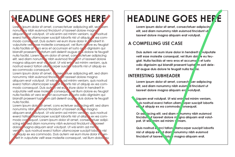
Have you ever seen a reference to the label,tl;dr? It means “Too long; Didn’t read”. While some readers do respond to long-form content, like this blog post, it’s generally a best practice to adopt a “less is more” strategy on your main menu pages.
If you can eliminate content while still making your points clear, then you are on the right track. That said, use care when editing content that includes long-tail keywords needed for search engine optimization.
While some people will not read dense blobs of text, they will often skim a page looking for items of interest. Headers can help to organize the content, but they also work to inform those skimmers.
For legibility, it’s best to provide wide margins around content to make it easier to read the content. Use bullet points when needed for items like lists, but don’t use them too much, or they will lose their impact.
Simplify the Navigation
Your audience wants to get the information they need quickly, and simply. They don’t want to hunt through a menu with too many options or that lacks a coherent structure. So, focus on the most important items – your building products, how to contact you, how to get support, or how to download BIM and technical content.
Avoid the temptation to add a series of “dropdown submenus” – those can get very unwieldy on mobile devices, and might not work well with certain browsers.
Instead, consider adding secondary elements to a footer menu, or create a second set of menus to appear in specific sections of your website.
Where appropriate, do hyperlink relevant content from one page to another. Not only does this guide the user on a buyer’s journey, but it also helps the search engines as they index your website. Crosslinks do help with SEO, so you get a bit of a bump from doing this right.
Clear Calls to Action
If you want your customers to take action, you should make that call to action or CTA as clear as possible. On the Concora website, for example, you’ll see bright “Book a Demo” buttons on many pages. We don’t rely on hyperlinked text, as those can be more easily missed.
If you use landing pages, CTAs are even more important. For a landing page, you typically want the user to take one specific action.
You may also want to strip away the header and footer navigation on landing pages. The less you distract the visitor generally the better results you will have from your CTA and conversions.

